How To Design An Eye-Catching Banner For Print
6th Nov 2023
In a world full of competition, a well-designed, tangible banner can capture attention like a breath of fresh air. It serves as a silent yet eloquent ambassador for your brand, event, or message, weaving together imagery, colour, and text to communicate with passersby.
This guide will walk you through how to design an eye-catching banner for print, ensuring your message is not only seen but also remembered.
Understanding The Importance Of Banner Design
A branded banner is crucial - it is the first impression you make on your audience. Good design can attract potential customers and convey your message effectively, while a poor design can do the opposite. It's not just about beauty; it's about function. An effective banner can increase brand recognition, generate leads, and even convert onlookers into customers.
Defining Your Banner's Purpose and Target Audience
Outlining Your Banner's Goal
Before you delve into the creative process, pinpoint the purpose of your banner. Is it to inform, advertise, direct, or create brand awareness? Your goal will shape the content and design of your banner, dictating everything from imagery to the call to action.
Identifying Your Target Audience
Who are you talking to? Understanding your audience is key to creating a resonant design. Are they professionals, locals, youngsters, or perhaps attendees of a specific event? The answer will help you tailor your design's tone, visuals, and language to their preferences and expectations.
Selecting The Right Size and Format For Your Banner
Common Banner Sizes and Formats
Banners come in a variety of sizes and formats, from the standard rectangular roll-ups to large-scale vinyl banners. Common dimensions range from small (24"x72") to large (48"x96"), but the size can be customised to fit your specific needs.
Matching The Format To Your Purpose and Location
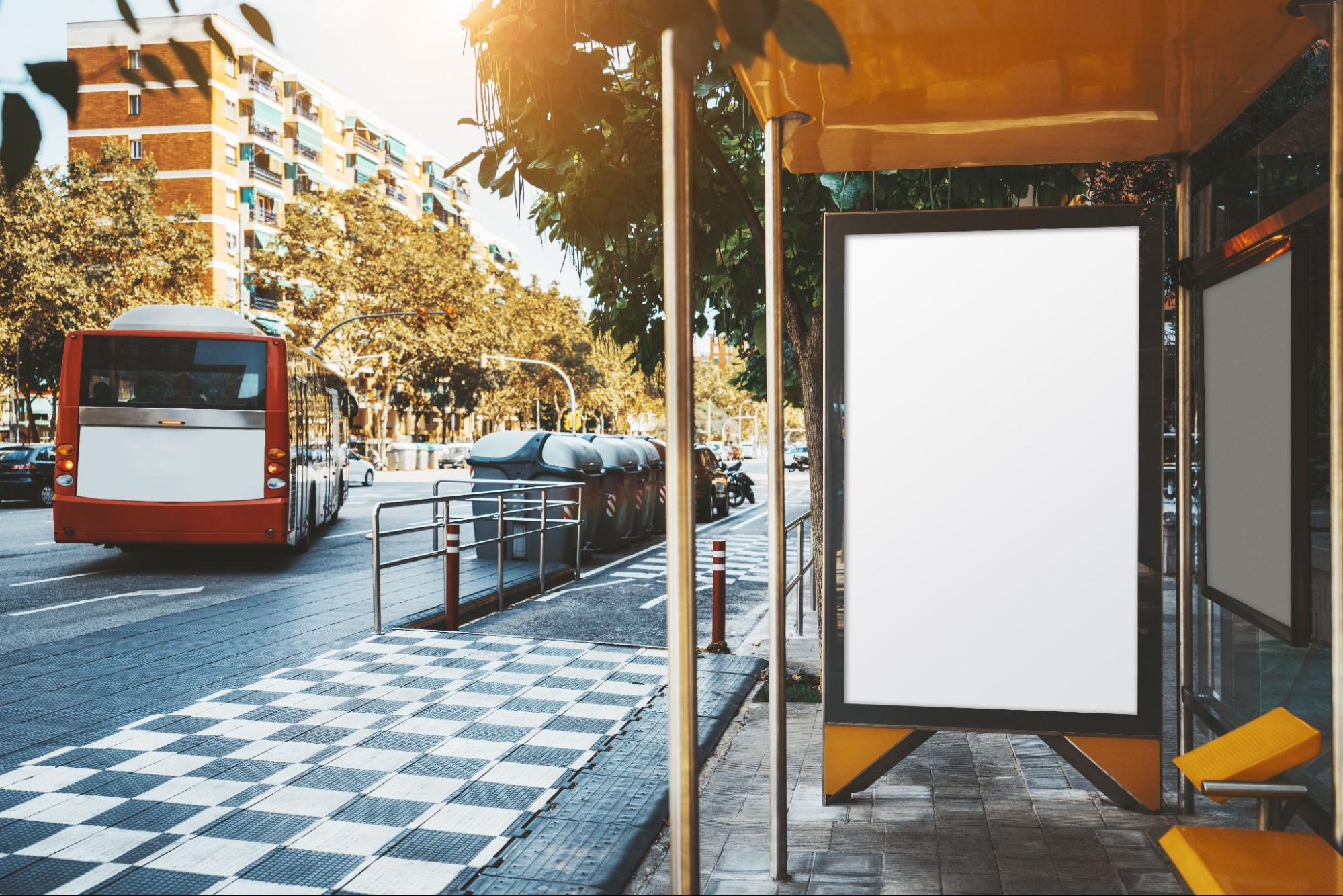
The banner's location and purpose will influence the size and format you select. A banner at a trade show might require a different approach compared to one displayed on a busy street. Consider the viewing distance and angle, the surrounding environment, and how the banner will be mounted.
Designing Your Banner
Choosing The Right Colour Scheme
Colour is a powerful tool in design. It can evoke emotions, highlight important information, and improve recall. Use your brand's colours for consistency, or select a palette that stands out in the intended environment. Ensure there's contrast between the background and text for readability.
Using High-Resolution Images
Nothing detracts from a banner's appeal like pixelated images. Use high-resolution images to ensure clarity, especially since banners are often viewed up close. This is paramount for creating a professional and trustworthy impression.
Selecting An Appropriate Font and Typography
Typography can make or break your banner. Choose fonts that are legible from a distance and reflect your message's tone. Ensure font sizes are large enough to be read from afar, and limit font varieties to maintain a cohesive look.
Crafting an Impactful Message
Keeping It Simple and Straightforward
With banners, less is often more. Your audience may only glance at the banner briefly, so convey your message succinctly. Avoid cluttering the space with too much text or complex language.
Creating A Call to Action
What do you want viewers to do after seeing your banner? Whether it's visiting a website, making a call, or stopping by a booth, your call to action should be clear and compelling.
Balancing The Elements of Your Design
Importance of Layout and White Space
A well-balanced layout with adequate white space can significantly enhance readability and impact. White space helps to focus attention on the core message and makes the design look uncluttered.
Arranging Elements For Visual Hierarchy
Create a visual hierarchy to guide the viewer's eye through the design in a way that prioritises information. The most important message should be the most prominent, with secondary details following in order of importance.
Tips For Designing A Print-Ready Banner
Using Vector Graphics For Scalability
Vector graphics are essential for print designs as they can be scaled without losing quality. This is particularly important for large-format prints like banners.
Checking Resolution For Print Quality
Ensure that all elements in your design are at least 300 dpi (dots per inch) for print. This will guarantee that the text and images are crisp and clear when printed.
Reviewing and Testing Your Banner Design
Proofreading For Errors
Carefully proofread your design to avoid typos or errors that can detract from your banner's professionalism.
Getting Feedback
Seek feedback from colleagues or members of your target audience. They may offer valuable insights that you hadn't considered.
Running a Test Print
Always run a test print, preferably at full scale, to check for any issues with colour, resolution, and overall impact.
Need Help Promoting Your Brand?
At TFH Gazebos, we understand the power of a perfectly pitched banner. That's why our bespoke printed accessories are designed to cater to your every need.
We're not just about printing; we're about bringing your brand to life. Each banner can be tailored with your logos, slogans, and unique branding elements to ensure your message resonates and endures. We strive to make the process of creating your ideal event and exhibition banners as seamless as possible, so you can stand out at the next trade show, market, or event with confidence and style.
⛺ You might like this guide: Why Your Business Needs A Printed Gazebo.
Frequently Asked Questions
What software can I use to design a banner for print?
You can use vector-based software like Adobe Illustrator or Photoshop for designing banners. These programs will help you create high-quality designs that are suitable for printing.
How can I ensure my banner is readable from a distance?
Use large, legible fonts and high-contrast colour combinations to ensure readability from a distance. Keep the message brief and to the point.
What types of images work best for print banners?
High-resolution, vector images or professionally taken photographs work best for print banners to ensure clarity and quality.
How much white space should I leave on my banner design?
While there is no set rule, a good practice is to use white space to balance design elements and avoid clutter. Typically, around 30-40% of your banner should be white space.